Design system: colors, fonts, spacing
Set your site's colors, fonts, type scale, spacing, shapes, buttons and motion in one place. Change a value and every page follows.
Your site's design system is one set of values: colors, fonts, type sizes, spacing, radii, shadows and buttons. Change a value in Design and every page that uses it follows.
That works because styles point at the system instead of copying its numbers. Text set to the H2 size uses the variable for H2, not "52 px". Change H2 in Design, and every heading, card title and button that uses it changes too. A raw number would stay behind and drift. The agent works from the same values, so what it builds stays on brand.
Edit your design system
-
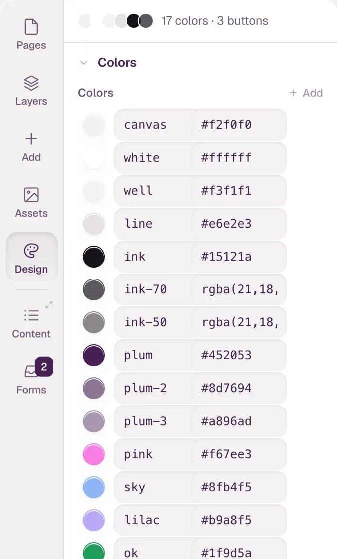
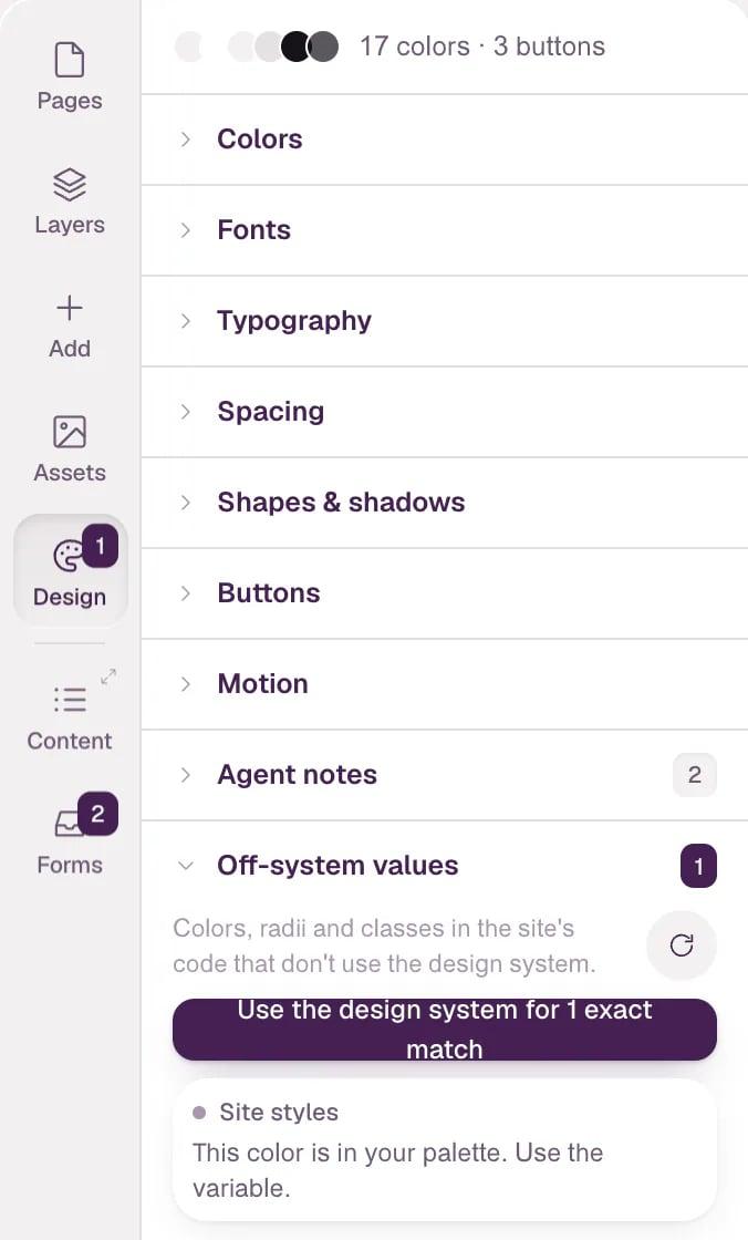
Press D or click Design in the left bar. The line at the top counts your colors and buttons; the groups are below it.
-
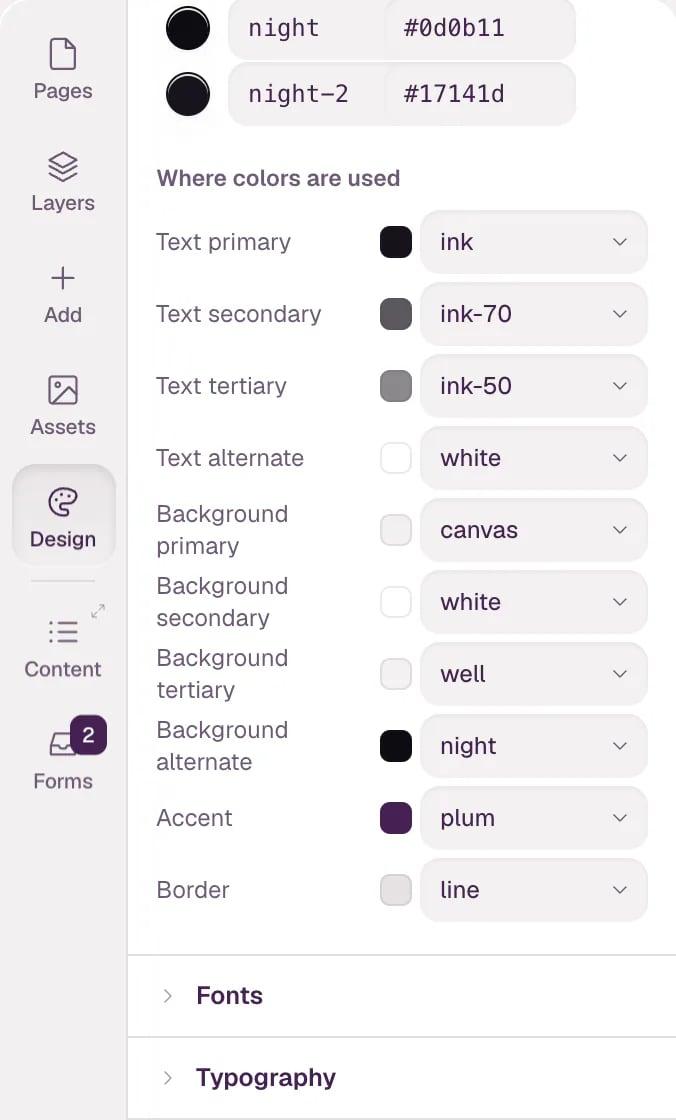
Open Colors. The palette lists each color by name and value; change a value, or click + Add for a new color. Below the palette, Where colors are used gives each role a palette color: Text primary, Background secondary, Accent, Border and more. Pick another color for a role and everything in that role follows.
-
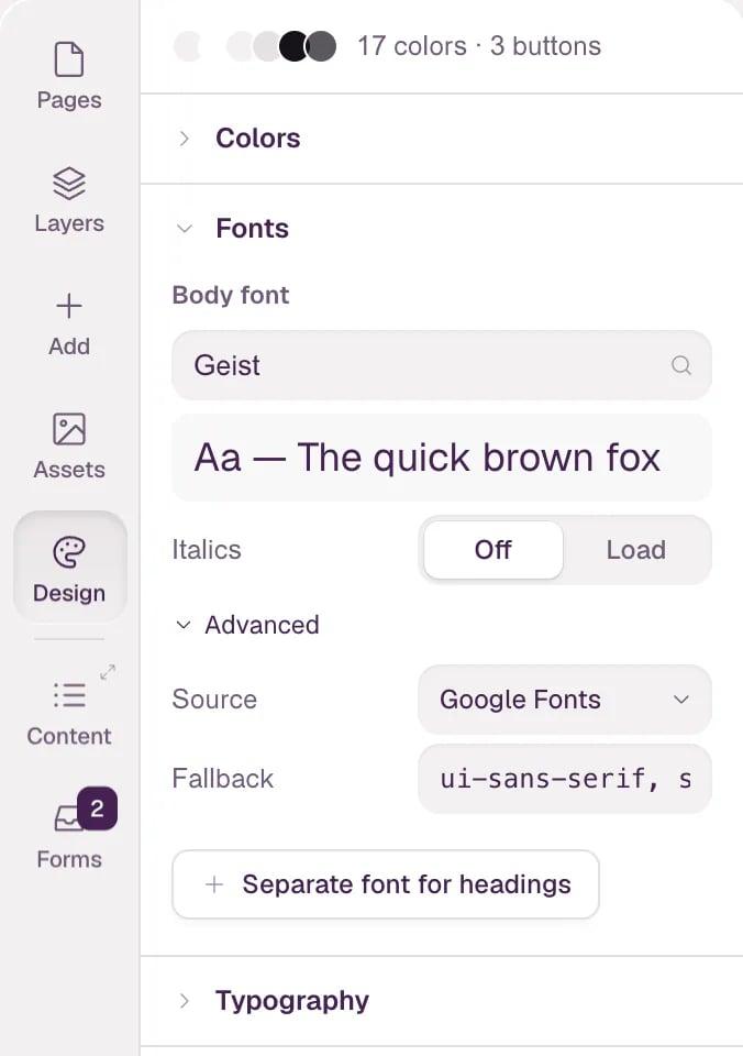
Open Fonts. Type a family into Body font; the list suggests Google Fonts, each shown in its own face, with a sample line below. Italics loads the italic styles too. Under Advanced, Source switches between Google Fonts, Custom (upload) for your own font files, and System. + Separate font for headings adds a second family for headings.
-
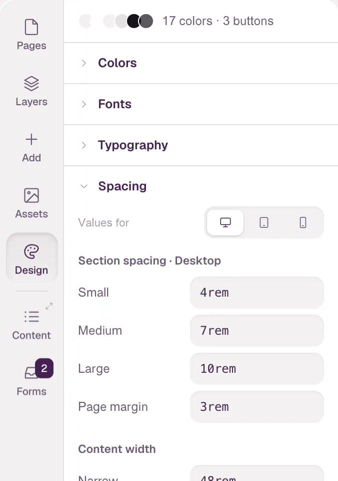
Open Typography or Spacing. Values for at the top switches between Desktop, Tablet and Mobile, so each screen size can have its own values. Typography has a row for each text style — Display, H1 to H6, the text sizes and Label. Spacing has Section spacing, Page margin and Content width.
- The other groups work the same way:
- Shapes & shadows — corner radii and shadows. - Buttons — the primary button with its colors, border, radius, padding, font, shadow, hover and sizes, plus variants like Secondary and Light. + New variant adds one. - Motion — Reduced motion for visitors who ask their device for less motion: Calm for the whole site, or Per element. - Agent notes — notes the agent reads before every change, like your tone of voice and layout rules. + New note adds one.
-
Open Off-system values to find colors, radii and classes in the site's code that don't use the design system, and where they are. The Design button in the left bar shows how many there are. When a value matches a token exactly, Use the design system for … exact matches switches it to the token in one step.
Tip Every change in Design is one undo step. Next: The style panel, Breakpoint widths and Motion and interactions.